Code
data(rmb_datasets, package = "rmb")
rmb_datasets$study_design[rmb_datasets$object == "figure4_6"]
#> [1] "Illustrative teaching dataset used for residual and influence diagnostics in Chapter 4."This article uses the figure4_6 dataset to illustrate residual and influence diagnostics in linear regression, as described in RMB2e Chapter 4.
Residual diagnostics are an essential part of the five-step RMB regression workflow: after fitting a model, examining residuals against fitted values, normal quantile plots, and Cook’s distance identifies violations of linearity, homoscedasticity, and normality that can invalidate inference. The figure4_6 dataset provides 100 observations of a single predictor x that serves as the basis for a pedagogical illustration of these diagnostic tools (RMB2e Ch. 4).
data(rmb_datasets, package = "rmb")
rmb_datasets$study_design[rmb_datasets$object == "figure4_6"]
#> [1] "Illustrative teaching dataset used for residual and influence diagnostics in Chapter 4."Do the standard regression diagnostic plots reveal any violations of linear model assumptions for data simulated from a linear relationship with normally distributed errors?
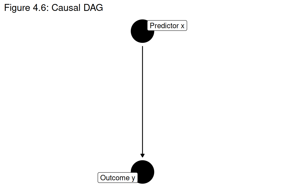
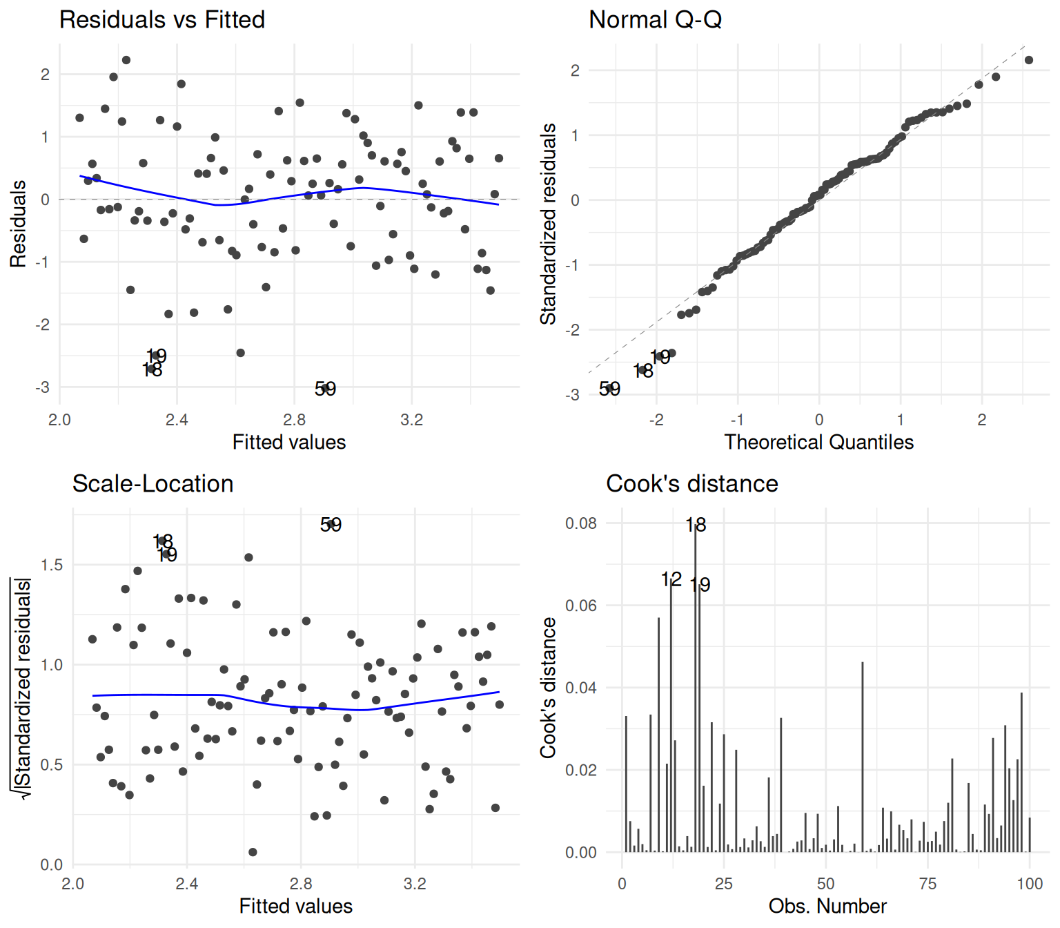
A simple linear regression of a simulated outcome y (constructed from x with normally distributed errors) is fitted, and the full suite of diagnostic plots from RMB2e Chapter 4 is produced: residuals vs fitted, normal Q-Q, scale-location, and Cook’s distance (RMB2e Ch. 4).
set.seed(42)
y <- 2 + 1.5 * dat$x + stats::rnorm(100)
demo_df <- data.frame(x = dat$x, y = y)

formula_main <- y ~ x
formula_main
#> y ~ xggplot2::ggplot(demo_df, ggplot2::aes(x = x, y = y)) +
ggplot2::geom_point(alpha = 0.4, size = 1.2) +
ggplot2::geom_smooth(method = "lm", se = FALSE, color = "#d95f02", linewidth = 1) +
ggplot2::labs(
title = "Figure 4.6: Simulated data for diagnostic illustration",
x = "x",
y = "y (simulated)"
) +
ggplot2::theme_minimal()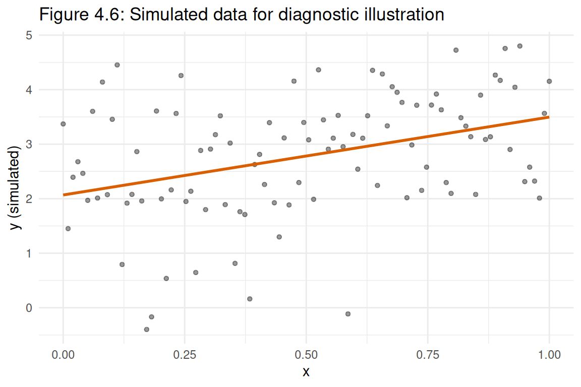
fit <- stats::lm(formula_main, data = demo_df)
summary(fit)
#>
#> Call:
#> stats::lm(formula = formula_main, data = demo_df)
#>
#> Residuals:
#>     Min      1Q  Median      3Q     Max
#> -3.0195 -0.6618  0.0809  0.6527  2.2264
#>
#> Coefficients:
#>             Estimate Std. Error t value Pr(>|t|)
#> (Intercept)   2.0682     0.2077   9.956  < 2e-16 ***
#> x             1.4286     0.3589   3.981 0.000132 ***
#> ---
#> Signif. codes:  0 '***' 0.001 '**' 0.01 '*' 0.05 '.' 0.1 ' ' 1
#>
#> Residual standard error: 1.046 on 98 degrees of freedom
#> Multiple R-squared:  0.1392, Adjusted R-squared:  0.1304
#> F-statistic: 15.85 on 1 and 98 DF, p-value: 0.000132if (!requireNamespace("ggfortify", quietly = TRUE)) {
stop("Package 'ggfortify' is required for model diagnostic autoplots.")
}
ggplot2::autoplot(
fit,
which = 1:4,
ncol = 2
) +
ggplot2::theme_minimal()autoplot.lm.
ci <- stats::confint(fit)
coefs <- summary(fit)$coefficients
knitr::kable(data.frame(
  term = rownames(coefs),
  estimate = coefs[, "Estimate"],
  conf_low = ci[, 1],
  conf_high = ci[, 2],
  p_value = coefs[, "Pr(>|t|)"]
), digits = 3)| term | estimate | conf_low | conf_high | p_value | |
|---|---|---|---|---|---|
| (Intercept) | (Intercept) | 2.068 | 1.656 | 2.480 | 0 |
| x | x | 1.429 | 0.716 | 2.141 | 0 |
When data truly follow a linear model with homoscedastic normal errors, the four standard diagnostic plots should show: no pattern in residuals vs fitted, points falling close to the diagonal in the Q-Q plot, roughly constant spread in the scale-location plot, and no observations with large Cook’s distances (RMB2e Ch. 4). This simulated dataset with correct model specification provides a baseline reference for what “good” diagnostics look like, against which practitioners can compare plots from real datasets where assumptions may be violated.