Code
data(rmb_datasets, package = "rmb")
rmb_datasets$study_design[rmb_datasets$object == "figure4_12"]
#> [1] "Illustrative teaching dataset used for model-checking examples in Chapter 4."This article uses the figure4_12 dataset to illustrate how identical summary statistics can mask radically different residual structures, motivating visual model checking in linear regression (RMB2e Chapter 4).
The famous Anscombe quartet (1973) demonstrated that four datasets with nearly identical means, variances, correlations, and regression coefficients can exhibit fundamentally different scatter patterns— a stark lesson that numerical summaries alone are insufficient for model assessment. The figure4_12 dataset contains three outcomes (y1, y2, y3) on a common predictor x, all yielding similar fitted coefficients but very different residual diagnostics (RMB2e Ch. 4). Examining residual plots is the only reliable way to detect misspecification that summary statistics would miss.
data(rmb_datasets, package = "rmb")
rmb_datasets$study_design[rmb_datasets$object == "figure4_12"]
#> [1] "Illustrative teaching dataset used for model-checking examples in Chapter 4."Do three outcomes sharing a common predictor yield the same regression coefficients but different residual diagnostic patterns?
set.seed(42)
dag <- ggdag::dagify(
  y1 ~ x,
  y2 ~ x,
  y3 ~ x,
  labels = c(
    x = "Predictor x",
    y1 = "Outcome y1",
    y2 = "Outcome y2",
    y3 = "Outcome y3"
  ),
  exposure = "x",
  outcome = "y1"
)
ggdag::ggdag(dag, use_labels = "label", text = FALSE) +
  ggdag::theme_dag_blank() +
  ggplot2::labs(title = "Figure 4.12: Causal DAG")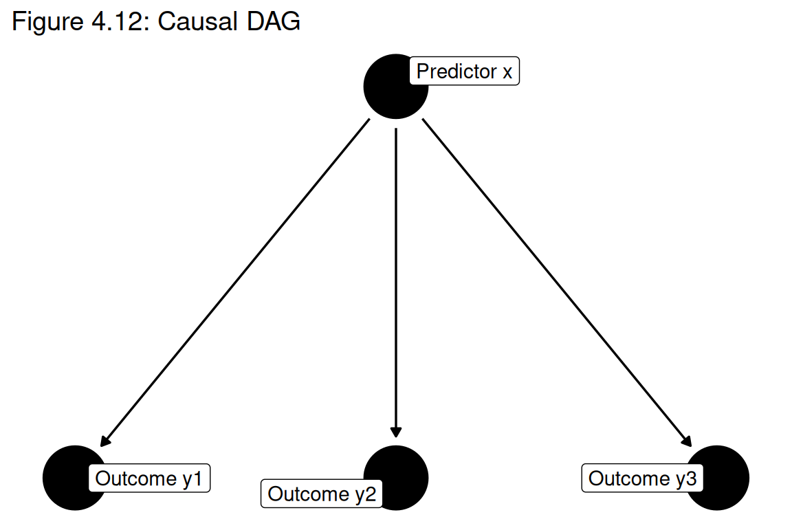
data(figure4_12, package = "rmb")
dat <- figure4_12
dim(dat)
#> [1] 26  4
summary(dat)
#>        y1              y2              y3              x
#>  Min.   :14.01   Min.   :14.01   Min.   :14.01   Min.   :32.47
#>  1st Qu.:17.44   1st Qu.:17.44   1st Qu.:17.44   1st Qu.:36.52
#>  Median :20.57   Median :20.57   Median :20.57   Median :40.56
#>  Mean   :20.24   Mean   :20.93   Mean   :20.05   Mean   :40.76
#>  3rd Qu.:22.37   3rd Qu.:22.56   3rd Qu.:22.37   3rd Qu.:42.94
#> Max. :29.80 Max. :39.62 Max. :26.40 Max. :60.00Separate simple linear regressions of y1, y2, and y3 on x are fitted, and their coefficients, R², and residual standard errors are compared. Residual-vs-fitted plots are then produced to reveal the different underlying data structures (RMB2e Ch. 4).
formula_y1 <- y1 ~ x
formula_y2 <- y2 ~ x
formula_y3 <- y3 ~ x

list(y1 = formula_y1, y2 = formula_y2, y3 = formula_y3)
#> $y1
#> y1 ~ x
#>
#> $y2
#> y2 ~ x
#>
#> $y3
#> y3 ~ xwith(dat, cor(cbind(y1, y2, y3, x)))
#> y1 y2 y3 x
#> y1 1.0000000 0.7544110 0.9706080 0.8143003
#> y2 0.7544110 1.0000000 0.7474330 0.5395689
#> y3 0.9706080 0.7474330 1.0000000 0.7113343
#> x 0.8143003 0.5395689 0.7113343 1.0000000
with(dat, sapply(list(y1 = y1, y2 = y2, y3 = y3), mean))
#> y1 y2 y3
#> 20.23962 20.92832 20.05449
with(dat, sapply(list(y1 = y1, y2 = y2, y3 = y3), var))
#> y1 y2 y3
#> 13.99620 28.43680 11.20608dat_long <- data.frame(
x = rep(dat$x, 3),
y = c(dat$y1, dat$y2, dat$y3),
outcome = rep(c("y1", "y2", "y3"), each = nrow(dat))
)
ggplot2::ggplot(dat_long, ggplot2::aes(x = x, y = y)) +
ggplot2::geom_point() +
ggplot2::geom_smooth(method = "lm", se = FALSE, color = "#d95f02", linewidth = 1) +
ggplot2::facet_wrap(~outcome, scales = "free_y") +
ggplot2::labs(x = "x", y = "y") +
ggplot2::theme_minimal()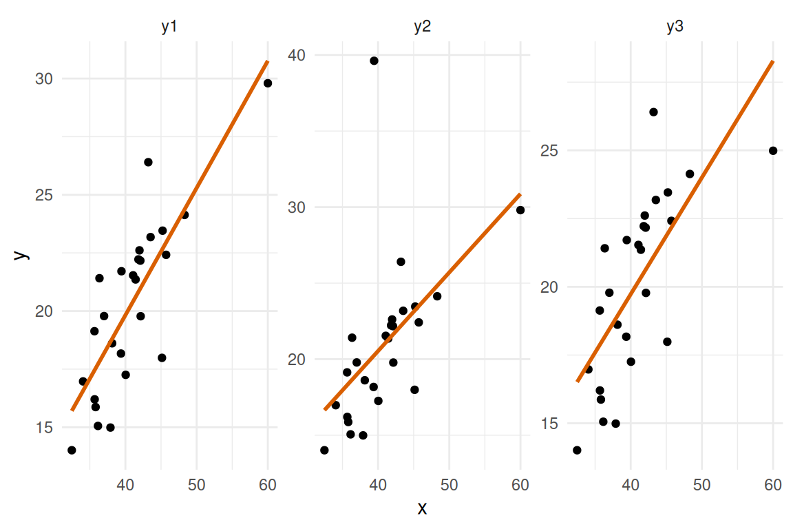
fit1 <- stats::lm(formula_y1, data = dat)
fit2 <- stats::lm(formula_y2, data = dat)
fit3 <- stats::lm(formula_y3, data = dat)

coef_table <- data.frame(
  outcome = c("y1", "y2", "y3"),
  intercept = c(stats::coef(fit1)[1], stats::coef(fit2)[1], stats::coef(fit3)[1]),
  slope_x = c(stats::coef(fit1)[2], stats::coef(fit2)[2], stats::coef(fit3)[2]),
  r_squared = c(summary(fit1)$r.squared, summary(fit2)$r.squared, summary(fit3)$r.squared),
  sigma = c(summary(fit1)$sigma, summary(fit2)$sigma, summary(fit3)$sigma)
)
coef_table
#>   outcome  intercept   slope_x r_squared    sigma
#> 1      y1 -2.0563688 0.5470173 0.6630849 2.216306
#> 2      y2 -0.1300401 0.5166527 0.2911346 4.582333
#> 3 y3 2.6268792 0.4275748 0.5059965 2.401355fit_data_long <- data.frame(
fitted = c(stats::fitted(fit1), stats::fitted(fit2), stats::fitted(fit3)),
residuals = c(stats::residuals(fit1), stats::residuals(fit2), stats::residuals(fit3)),
model = rep(c("y1", "y2", "y3"), each = nrow(dat))
)
ggplot2::ggplot(fit_data_long, ggplot2::aes(x = fitted, y = residuals)) +
ggplot2::geom_point() +
ggplot2::geom_hline(yintercept = 0, linetype = "dashed", color = "red") +
ggplot2::geom_smooth(se = FALSE, color = "blue") +
ggplot2::facet_wrap(~model, scales = "free") +
ggplot2::labs(x = "Fitted values", y = "Residuals") +
ggplot2::theme_minimal()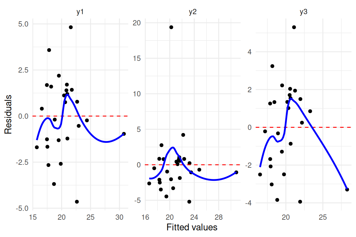
ci1 <- stats::confint(fit1)
ci2 <- stats::confint(fit2)
ci3 <- stats::confint(fit3)

data.frame(
  outcome = c("y1", "y2", "y3"),
  slope_est = c(stats::coef(fit1)["x"], stats::coef(fit2)["x"], stats::coef(fit3)["x"]),
  conf_low = c(ci1["x", 1], ci2["x", 1], ci3["x", 1]),
  conf_high = c(ci1["x", 2], ci2["x", 2], ci3["x", 2])
)
#>   outcome slope_est  conf_low conf_high
#> 1      y1 0.5470173 0.3827468 0.7112877
#> 2      y2 0.5166527 0.1770146 0.8562908
#> 3 y3 0.4275748 0.2495887 0.6055609The three outcomes yield nearly identical intercepts, slopes, R² values, and residual standard errors, yet their residual-vs-fitted plots reveal fundamentally different patterns: y1 may show approximately random scatter (suitable for linear regression), y2 exhibits a systematic curve (suggesting a nonlinear term is needed), and y3 may show the influence of an outlier (RMB2e Ch. 4). This dataset reinforces the core message of RMB2e Chapter 4: residual plots are an indispensable complement to numerical summaries, and model adequacy must be verified visually before drawing scientific conclusions.