---
title: "Exploratory and Descriptive Methods"
format:
html: default
revealjs:
output-file: exploratory-descriptive-slides.html
pdf:
output-file: exploratory-descriptive-handout.pdf
docx:
output-file: exploratory-descriptive-handout.docx
---
{{< include shared-config.qmd >}}
::: {.callout-note}
This chapter is adapted from @vittinghoff2e, Chapter 2.
:::
---
# Introduction
Before fitting regression models,
it is good practice to explore and summarize the data.
Exploratory data analysis (EDA) serves several purposes:
- Understand the distribution of each variable individually.
- Detect unusual values, outliers, and missing data.
- Identify patterns and relationships among variables.
- Motivate choices of model structure (e.g., transformations).
- Provide context for interpreting model results.
---
In this chapter we illustrate exploratory and descriptive techniques
using the Western Collaborative Group Study (WCGS) dataset.
{{< include _subfiles/logistic-regression/_sec_intro_wcgs.qmd >}}
---
```{r}
#| label: load-wcgs
#| eval: false
### load the data directly from a UCSF website:
url <- paste0(
  "https://regression.ucsf.edu/sites/g/files/",
  "tkssra6706/f/wysiwyg/home/data/wcgs.dta"
)
wcgs <- haven::read_dta(url)
```
```{r}
#| label: load-wcgs-local
#| include: false
here::here() |>
fs::path("Data/wcgs.rda") |>
load()
```
```{r}
#| label: label-wcgs
wcgs <- wcgs |>
  labelled::set_variable_labels(
    age = "Age (years)",
    chol = "Cholesterol (mg/dL)",
    sbp = "Systolic BP (mmHg)",
    dbp = "Diastolic BP (mmHg)",
    bmi = "BMI (kg/m\u00B2)",
    weight = "Weight (lbs)",
    ncigs = "Cigarettes per day",
    chd69 = "CHD event by 1969",
    smoke = "Current smoker",
    arcus = "Arcus senilis",
    dibpat = "Behavioral pattern (A/B)",
    behpat = "Behavioral pattern (A1/A2/B3/B4)",
    wghtcat = "Weight category",
    agec = "Age group"
  )
```
# Summarizing a single variable
## Continuous variables
### Measures of center
:::{#def-mean}
#### Sample mean
The **sample mean** of a variable $x$ measured on $n$ observations is:
$$\bar{x} = \frac{1}{n}\sum_{i=1}^{n} x_i$$
:::
---
:::{#def-median}
#### Median
The **median** is the value that divides the sorted data in half:
50% of observations fall below and 50% above.
The median is more robust to outliers than the mean.
:::
---
### Measures of spread
:::{#def-eda-variance}
#### Sample variance
The **sample variance** is:
$$s^2 = \frac{1}{n-1}\sum_{i=1}^{n}(x_i - \bar{x})^2$$
:::
---
:::{#def-eda-sd}
#### Sample standard deviation
The **sample standard deviation** is the square root of the sample variance:
$$s = \sqrt{s^2}$$
The standard deviation has the same units as the original variable,
making it easier to interpret than the variance.
:::
---
:::{#def-quantile}
#### Quantiles and percentiles
The **$p$th quantile** (or **$(100p)$th percentile**) of a variable
is the value below which a proportion $p$ of the data falls.
Special cases:
- The **median** is the 50th percentile ($p = 0.5$).
- The **first quartile** (Q1) is the 25th percentile ($p = 0.25$).
- The **third quartile** (Q3) is the 75th percentile ($p = 0.75$).
:::
---
:::{#def-iqr}
#### Interquartile range
The **interquartile range** (IQR) is:
$$\text{IQR} = Q_3 - Q_1$$
The IQR contains the middle 50% of the data and
is more robust to outliers than the standard deviation.
:::
---
### Summary statistics in R
The `summary()` function provides a quick overview of any variable:
```{r}
#| label: summary-chol
#| code-fold: false
summary(wcgs$chol)
```
For a formatted summary table,
`gtsummary::tbl_summary()` is useful:
```{r}
#| label: tbl-wcgs-summary-continuous
#| tbl-cap: "WCGS: descriptive statistics for continuous variables"
wcgs |>
  dplyr::select(age, chol, sbp, dbp, bmi, weight) |>
  gtsummary::tbl_summary(
    statistic = list(
      gtsummary::all_continuous() ~
        "{mean} ({sd}); {median} [{p25}, {p75}]"
    ),
    digits = gtsummary::all_continuous() ~ 1
  )
```
## Binary and categorical variables
For binary and categorical variables,
the natural descriptive statistics are
**frequencies** (counts) and **proportions** (relative frequencies).
```{r}
#| label: tbl-wcgs-summary-cat
#| tbl-cap: "Frequency table for categorical variables in the WCGS dataset"
wcgs |>
  dplyr::select(chd69, smoke, dibpat, behpat, wghtcat) |>
  gtsummary::tbl_summary()
```
# Graphical methods
Graphs are often more informative than summary statistics alone.
Different graph types are appropriate for different variable types.
## Histograms
A **histogram** displays the distribution of a continuous variable
by dividing its range into bins and counting the number of observations in each.
```{r}
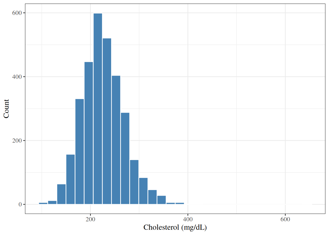
#| label: fig-hist-chol
#| fig-cap: "Histogram of total cholesterol in the WCGS dataset"
wcgs |>
  ggplot2::ggplot() +
  ggplot2::aes(x = chol) +
  ggplot2::geom_histogram(bins = 30, fill = "steelblue", color = "white") +
  ggplot2::labs(y = "Count")
```
---
The histogram in @fig-hist-chol shows that
cholesterol in the WCGS is roughly bell-shaped (approximately normal),
with most values between 150 and 350 mg/dL.
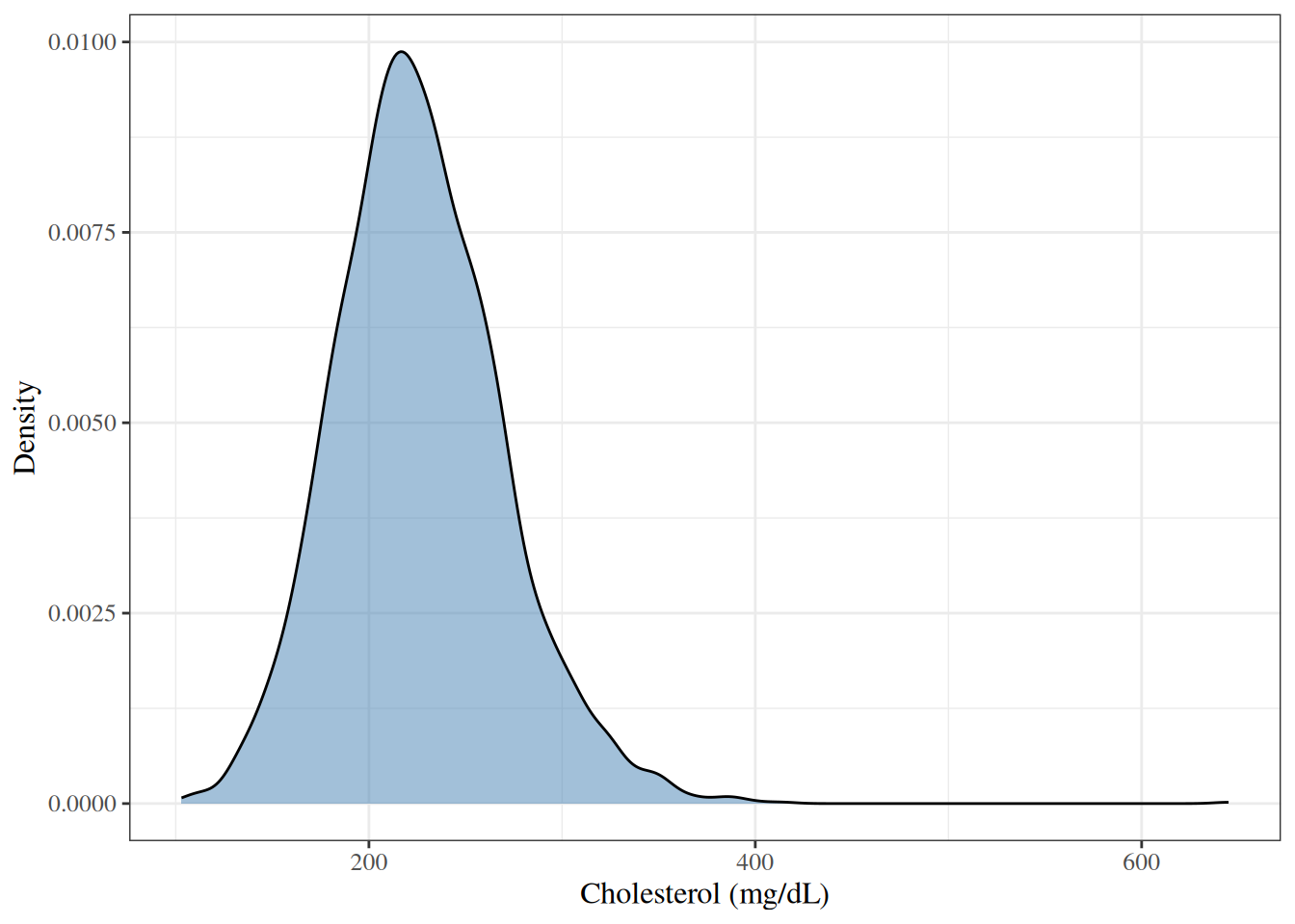
## Density plots
A **density plot** shows a smoothed estimate of the distribution,
which can be easier to interpret than a histogram.
```{r}
#| label: fig-density-chol
#| fig-cap: "Density plot of total cholesterol in the WCGS dataset"
wcgs |>
  ggplot2::ggplot() +
  ggplot2::aes(x = chol) +
  ggplot2::geom_density(fill = "steelblue", alpha = 0.5) +
  ggplot2::labs(y = "Density")
```
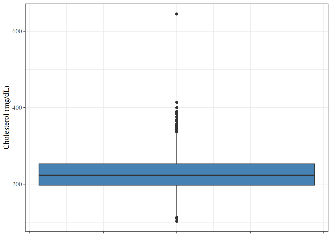
## Box plots
A **box plot** (or box-and-whisker plot) summarizes a distribution using
the median, quartiles, and extreme values.
The box spans Q1 to Q3 (the IQR).
The line inside the box is the median.
The whiskers extend to the most extreme observations
within $1.5 \times \text{IQR}$ of the box.
Points beyond the whiskers are plotted individually as potential outliers.
```{r}
#| label: fig-box-chol
#| fig-cap: "Box plot of total cholesterol in the WCGS dataset"
wcgs |>
  ggplot2::ggplot() +
  ggplot2::aes(y = chol) +
  ggplot2::geom_boxplot(fill = "steelblue") +
  ggplot2::theme(axis.text.x = ggplot2::element_blank())
```
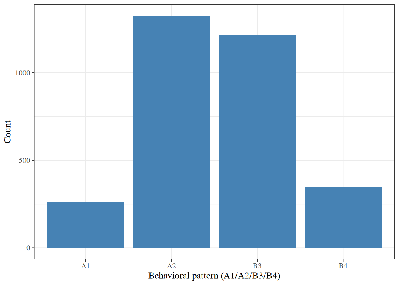
## Bar charts
A **bar chart** displays the frequency or proportion of each category
of a categorical variable.
```{r}
#| label: fig-bar-behpat
#| fig-cap: "Bar chart of behavioral pattern in the WCGS dataset"
wcgs |>
  ggplot2::ggplot() +
  ggplot2::aes(x = behpat) +
  ggplot2::geom_bar(fill = "steelblue") +
  ggplot2::labs(y = "Count")
```
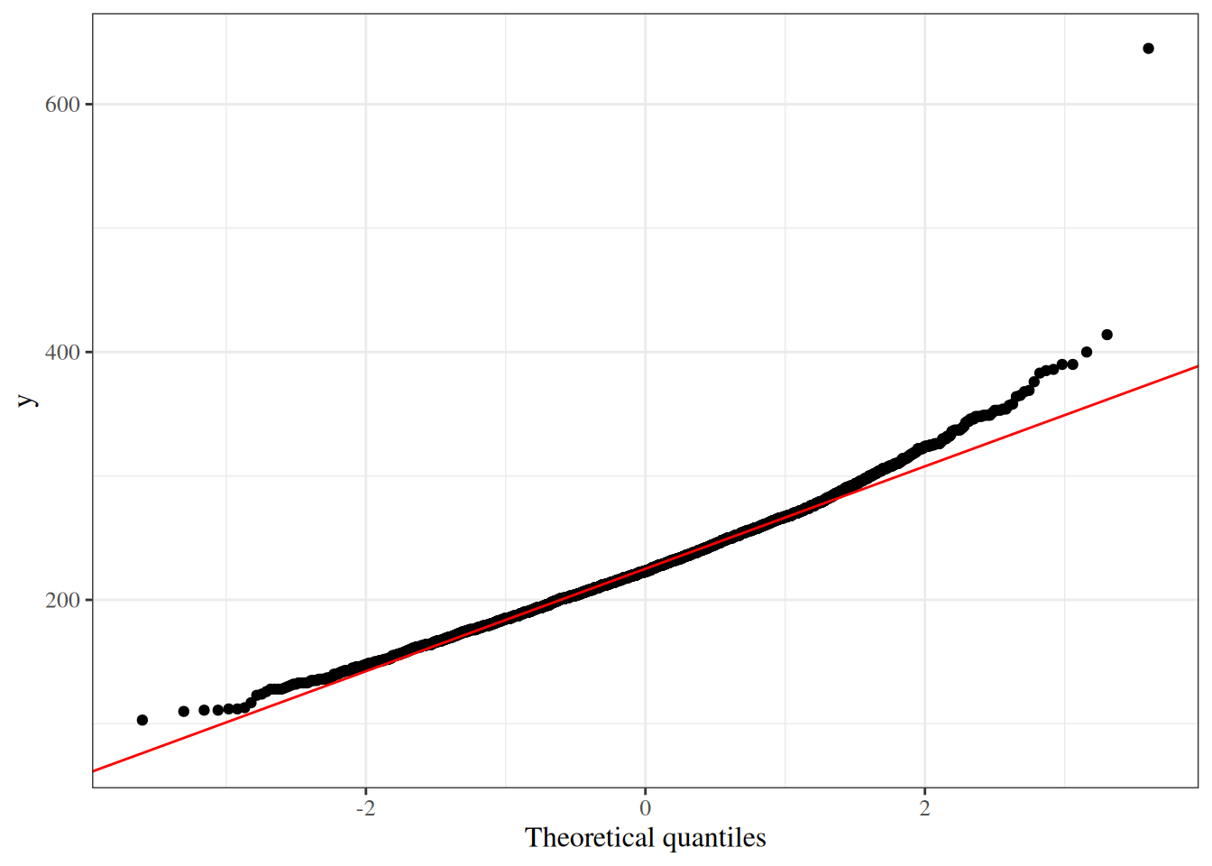
## Normal probability (Q-Q) plots
A **quantile-quantile (Q-Q) plot** compares the observed quantiles of a variable
to the theoretical quantiles of a normal distribution.
If the variable is approximately normally distributed,
the points fall close to the diagonal reference line.
```{r}
#| label: fig-qq-chol
#| fig-cap: "Normal Q-Q plot for total cholesterol in the WCGS dataset"
wcgs |>
  ggplot2::ggplot() +
  ggplot2::aes(sample = chol) +
  ggplot2::stat_qq() +
  ggplot2::stat_qq_line(color = "red") +
  ggplot2::labs(x = "Theoretical quantiles")
```
# Bivariate relationships
## Two continuous variables: scatter plots and correlation
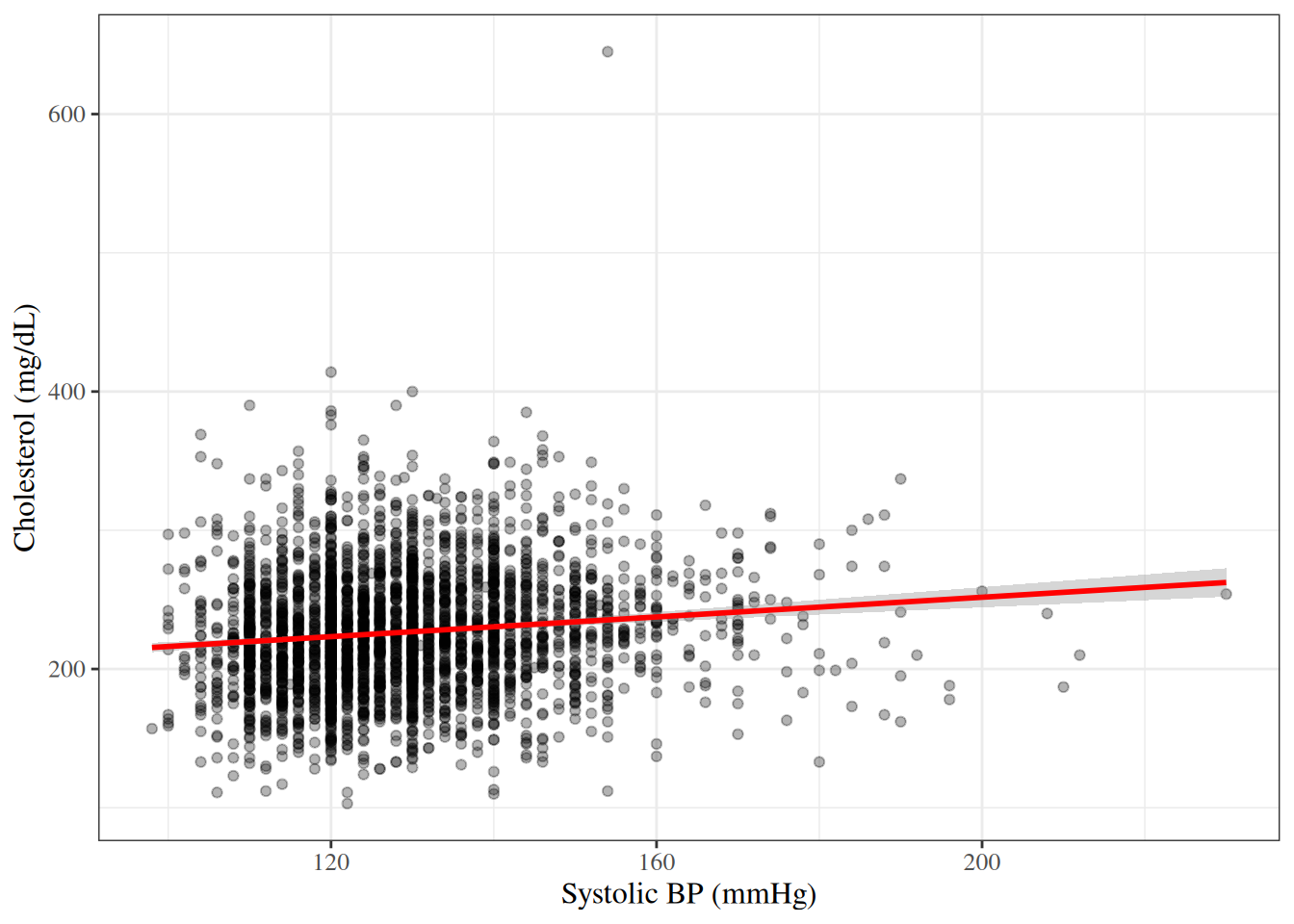
### Scatter plots
A **scatter plot** displays the relationship between two continuous variables
by plotting each observation as a point.
```{r}
#| label: fig-scatter-chol-sbp
#| fig-cap: "Cholesterol vs. systolic BP in the WCGS dataset"
wcgs |>
  ggplot2::ggplot() +
  ggplot2::aes(x = sbp, y = chol) +
  ggplot2::geom_point(alpha = 0.3) +
  ggplot2::geom_smooth(method = "lm", se = TRUE, color = "red")
```
### Correlation
:::{#def-correlation}
#### Pearson correlation coefficient
The **Pearson correlation coefficient** measures the strength and direction
of a linear relationship between two continuous variables $X$ and $Y$:
$$r = \frac{\sum_{i=1}^n (x_i - \bar{x})(y_i - \bar{y})}
{\sqrt{\sum_{i=1}^n (x_i - \bar{x})^2 \sum_{i=1}^n (y_i - \bar{y})^2}}$$
The correlation coefficient takes values in $[-1, 1]$:
- $r = 1$: perfect positive linear relationship.
- $r = -1$: perfect negative linear relationship.
- $r = 0$: no linear relationship.
:::
---
```{r}
#| label: cor-chol-sbp
#| code-fold: false
cor(wcgs$chol, wcgs$sbp, use = "complete.obs")
```
---
:::{.callout-caution}
Correlation measures only **linear** relationships.
Two variables can be strongly related but have a near-zero correlation
if the relationship is nonlinear.
Furthermore, correlation does not imply causation.
:::
## Continuous outcome by a binary or categorical variable
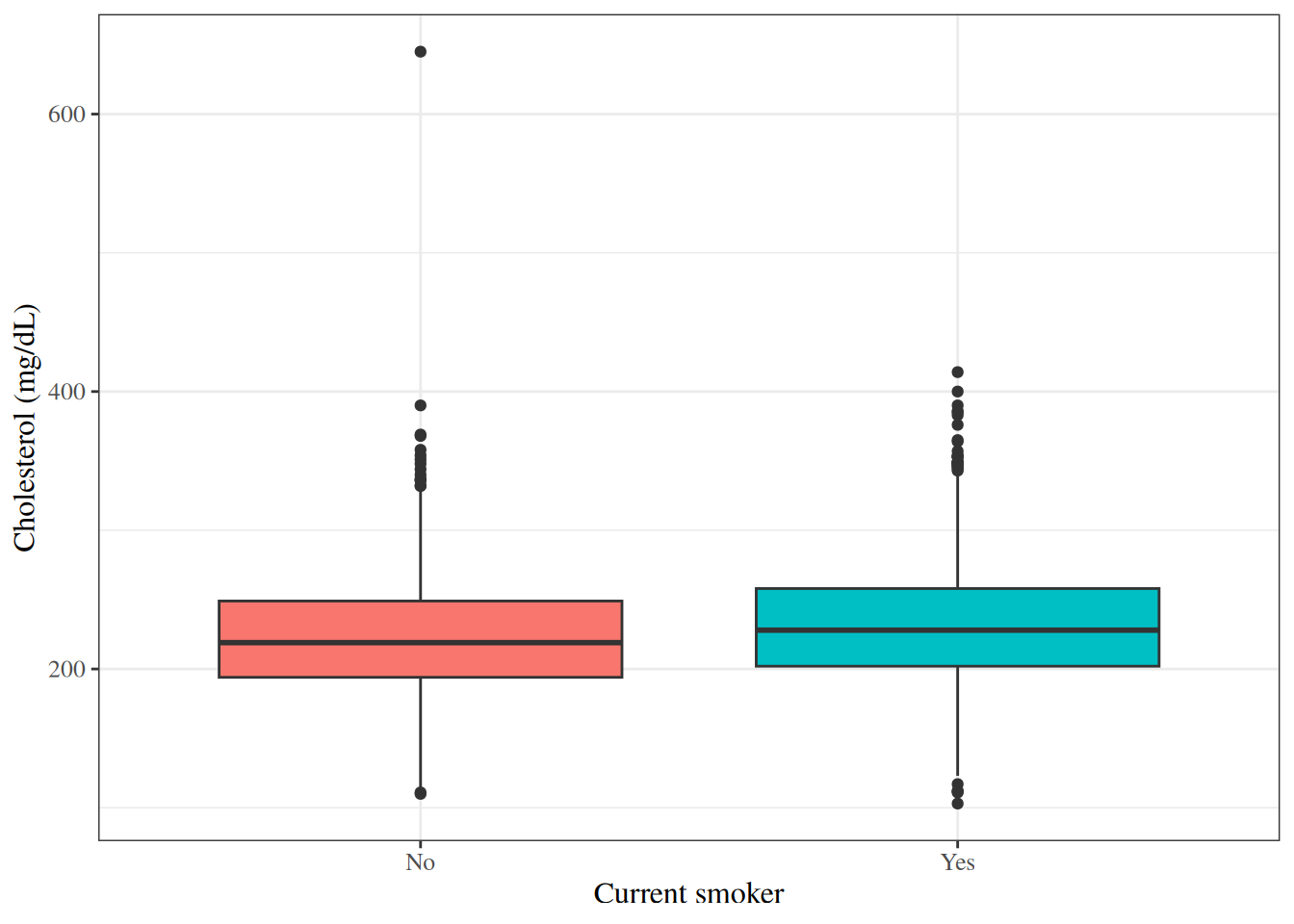
### Side-by-side box plots
Side-by-side box plots are useful for comparing the distribution of a
continuous variable across groups defined by a categorical variable.
```{r}
#| label: fig-box-chol-by-smoke
#| fig-cap: "Box plots of cholesterol by smoking status in the WCGS dataset"
wcgs |>
  ggplot2::ggplot() +
  ggplot2::aes(x = smoke, y = chol, fill = smoke) +
  ggplot2::geom_boxplot() +
  ggplot2::theme(legend.position = "none")
```
---
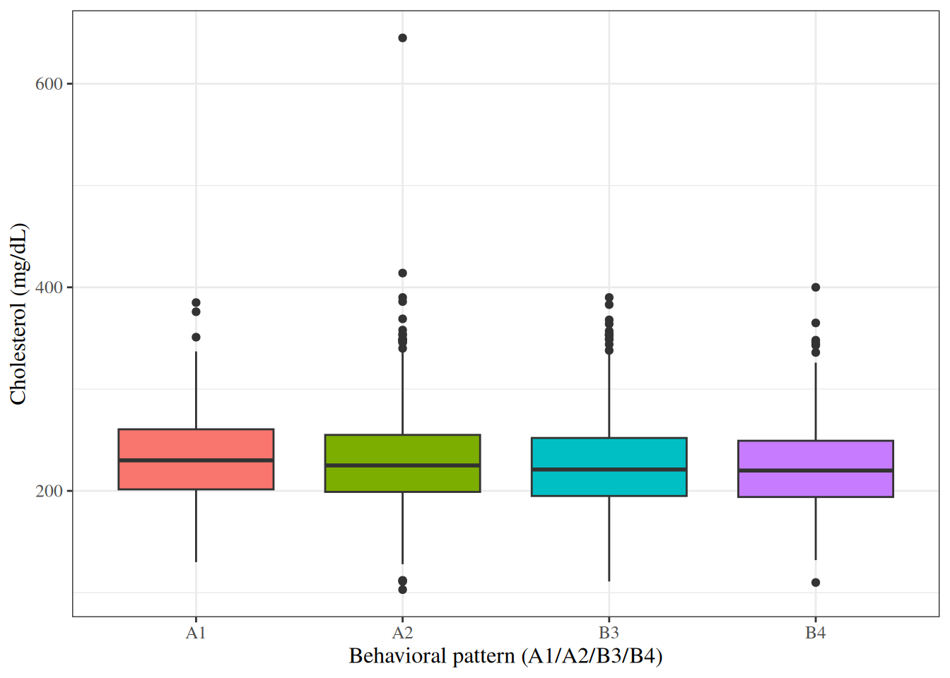
```{r}
#| label: fig-box-chol-by-behpat
#| fig-cap: "Box plots of cholesterol by behavioral pattern in the WCGS dataset"
wcgs |>
  ggplot2::ggplot() +
  ggplot2::aes(x = behpat, y = chol, fill = behpat) +
  ggplot2::geom_boxplot() +
  ggplot2::theme(legend.position = "none")
```
### Summary statistics by group
We can compute summary statistics separately for each group:
```{r}
#| label: tbl-chol-by-chd
#| tbl-cap: "Cholesterol summary statistics by CHD status"
wcgs |>
  dplyr::select(chol, sbp, bmi, chd69) |>
  gtsummary::tbl_summary(
    by = chd69,
    statistic = list(
      gtsummary::all_continuous() ~
        "{mean} ({sd})"
    ),
    digits = gtsummary::all_continuous() ~ 1
  ) |>
  gtsummary::add_overall() |>
  gtsummary::add_p()
```
## Two categorical variables: contingency tables
### Cross-tabulation
A **contingency table** (or **cross-tabulation**) displays the joint frequency
distribution of two categorical variables.
```{r}
#| label: tbl-cross-smoke-chd
#| tbl-cap: "Cross-tabulation of smoking status and CHD event in WCGS"
#| code-fold: false
table(Smoking = wcgs$smoke, CHD = wcgs$chd69)
```
---
We can also compute row proportions to examine the
conditional distribution of CHD given smoking status:
```{r}
#| label: tbl-cross-smoke-chd-prop
#| code-fold: false
prop.table(table(Smoking = wcgs$smoke, CHD = wcgs$chd69), margin = 1)
```
---
Using `gtsummary` for a formatted table:
```{r}
#| label: tbl-gtsummary-smoke-chd
#| tbl-cap: "Smoking status and CHD event in WCGS"
wcgs |>
  dplyr::select(smoke, chd69) |>
  gtsummary::tbl_summary(by = chd69) |>
  gtsummary::add_overall() |>
  gtsummary::add_p()
```
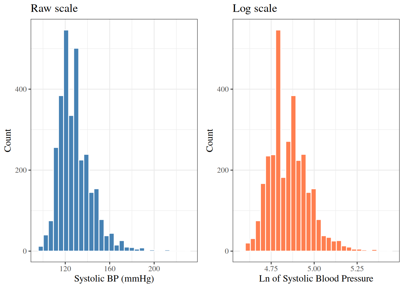
# Data transformations
When a continuous variable has a **right-skewed** distribution
(long tail to the right),
a **logarithmic transformation** often makes the distribution
more approximately normal.
Log-transformed variables also have a natural multiplicative interpretation:
a one-unit increase in $\log(x)$ corresponds to multiplying $x$ by $e \approx 2.72$.
---
The WCGS dataset already contains the log-transformed versions of some variables:
- `lnsbp`: $\log(\text{SBP})$
- `lnwght`: $\log(\text{weight})$
---
```{r}
#| label: fig-hist-sbp-log
#| fig-cap: "SBP distribution: raw and log scale (WCGS)"
p1 <- wcgs |>
  ggplot2::ggplot() +
  ggplot2::aes(x = sbp) +
  ggplot2::geom_histogram(bins = 30, fill = "steelblue", color = "white") +
  ggplot2::labs(y = "Count", title = "Raw scale")

p2 <- wcgs |>
  ggplot2::ggplot() +
  ggplot2::aes(x = lnsbp) +
  ggplot2::geom_histogram(bins = 30, fill = "coral", color = "white") +
  ggplot2::labs(y = "Count", title = "Log scale")

gridExtra::grid.arrange(p1, p2, ncol = 2)
```
---
The log-transformed SBP is slightly more symmetric than the raw SBP.
Whether to use the transformation in a regression model depends on
assumptions of that model and the scientific question.
# Putting it all together: an EDA workflow
A typical exploratory data analysis workflow might proceed as follows:
1. **Understand the dataset**: number of observations, variables, and their types.
2. **Examine each variable individually**:
- Continuous: histogram, box plot, mean, SD, median, IQR.
- Categorical: bar chart, frequency table.
- Note missing values, unusual values, and outliers.
3. **Examine relationships between variables**:
- Two continuous variables: scatter plot, correlation.
- Continuous by category: side-by-side box plots, group means.
- Two categorical variables: contingency table.
4. **Consider transformations** for skewed continuous variables.
5. **Summarize findings** to guide model-building decisions.
---
```{r}
#| label: tbl-wcgs-all-summary
#| tbl-cap: "Summary of selected WCGS variables"
wcgs |>
  dplyr::select(
    age, chol, sbp, dbp, bmi, weight, ncigs,
    chd69, smoke, dibpat, behpat
  ) |>
  gtsummary::tbl_summary()
```
# References {.unnumbered}
::: {#refs}
:::